Code
library(tidyverse)  # For ggplot, dplyr, and friends
library(WDI)        # Get data from the World Bank
library(ggrepel)    # For non-overlapping labels
library(ggtext) # For fancier text handlingExample for Monday, July 3, 2023–Friday, July 7, 2023
For this example, we’re again going to use cross-national data from the World Bank’s Open Data portal. We’ll download the data with the {WDI} package.
If you want to skip the data downloading, you can download the data below (you’ll likely need to right click and choose “Save Link As…”):
This is a slightly cleaned up version of the code from the video.
First, we load the libraries we’ll be using:
library(tidyverse) # For ggplot, dplyr, and friends
library(WDI) # Get data from the World Bank
library(ggrepel) # For non-overlapping labels
library(ggtext) # For fancier text handlingindicators <- c(population = "SP.POP.TOTL", # Population
co2_emissions = "EN.ATM.CO2E.PC", # CO2 emissions
gdp_per_cap = "NY.GDP.PCAP.KD") # GDP per capita
wdi_co2_raw <- WDI(country = "all", indicators, extra = TRUE,
start = 1995, end = 2015)Then we clean the data by removing non-country countries:
wdi_clean <- wdi_co2_raw %>%
filter(region != "Aggregates")Next we’ll do some substantial filtering and reshaping so that we can end up with the rankings of CO2 emissions in 1995 and 2014. I annotate as much as possible below so you can see what’s happening in each step.
co2_rankings <- wdi_clean %>%
  # Get rid of smaller countries
  filter(population > 200000) %>%
  # Only look at two years
  filter(year %in% c(1995, 2014)) %>%
  # Get rid of all the rows that have missing values in co2_emissions
  drop_na(co2_emissions) %>%
  # Look at each year individually and rank countries based on their emissions that year
  group_by(year) %>%
  mutate(ranking = rank(co2_emissions)) %>%
  ungroup() %>%
  # Only select a handful of columns, mostly just the newly created "ranking"
  # column and some country identifiers
  select(iso3c, country, year, region, income, ranking) %>%
  # Right now the data is tidy and long, but we want to widen it and create
  # separate columns for emissions in 1995 and in 2014. pivot_wider() will make
  # new columns based on the existing "year" column (that's what `names_from`
  # does), and it will add "rank_" as the prefix, so that the new columns will
  # be "rank_1995" and "rank_2014". The values that go in those new columns will
  # come from the existing "ranking" column
  pivot_wider(names_from = year, names_prefix = "rank_", values_from = ranking) %>%
  # Find the difference in ranking between 2014 and 1995
  mutate(rank_diff = rank_2014 - rank_1995) %>%
  # Remove all rows where there's a missing value in the rank_diff column
  drop_na(rank_diff) %>%
  # Make an indicator variable that is true of the absolute value of the
  # difference in rankings is greater than 25. 25 is arbitrary here—that just
  # felt like a big change in rankings
  mutate(big_change = ifelse(abs(rank_diff) >= 25, TRUE, FALSE)) %>%
  # Make another indicator variable that indicates if the rank improved by a
  # lot, worsened by a lot, or didn't change much. We use the case_when()
  # function, which is like a fancy version of ifelse() that takes multiple
  # conditions. This is how it generally works:
  #
  # case_when(
  #  some_test ~ value_if_true,
  #  some_other_test ~ value_if_true,
  #  TRUE ~ value_otherwise
  #)
  mutate(better_big_change = case_when(
    rank_diff <= -25 ~ "Rank improved",
    rank_diff >= 25 ~ "Rank worsened",
    TRUE ~ "Rank changed a little"
  ))
Here’s what that reshaped data looked like before:
head(wdi_clean)
## # A tibble: 6 × 15
##   country     iso2c iso3c  year status lastupdated population co2_emissions gdp_per_cap region     capital longitude latitude income     lending
##   <chr>       <chr> <chr> <dbl> <lgl>  <date>           <dbl>         <dbl>       <dbl> <chr>      <chr>       <dbl>    <dbl> <chr>      <chr>
## 1 Afghanistan AF    AFG    2015 NA     2023-05-10    33753499        0.176         592. South Asia Kabul        69.2     34.5 Low income IDA
## 2 Afghanistan AF    AFG    1997 NA     2023-05-10    17788819        0.0617         NA  South Asia Kabul        69.2     34.5 Low income IDA
## 3 Afghanistan AF    AFG    2014 NA     2023-05-10    32716210        0.149         603. South Asia Kabul        69.2     34.5 Low income IDA
## 4 Afghanistan AF    AFG    2003 NA     2023-05-10    22645130        0.0538        363. South Asia Kabul        69.2     34.5 Low income IDA
## 5 Afghanistan AF    AFG    2000 NA     2023-05-10    19542982        0.0389         NA  South Asia Kabul        69.2     34.5 Low income IDA
## 6 Afghanistan AF    AFG    2002 NA     2023-05-10    21000256        0.0492        360. South Asia Kabul        69.2     34.5 Low income IDA
And here’s what it looks like now:
head(co2_rankings)
## # A tibble: 6 × 9
##   iso3c country     region                     income              rank_2014 rank_1995 rank_diff big_change better_big_change
##   <chr> <chr>       <chr>                      <chr>                   <dbl>     <dbl>     <dbl> <lgl>      <chr>
## 1 AFG   Afghanistan South Asia                 Low income                 12        16        -4 FALSE      Rank changed a little
## 2 ALB   Albania     Europe & Central Asia      Upper middle income        72        52        20 FALSE      Rank changed a little
## 3 DZA   Algeria     Middle East & North Africa Lower middle income       107        95        12 FALSE      Rank changed a little
## 4 AGO   Angola      Sub-Saharan Africa         Lower middle income        64        65        -1 FALSE      Rank changed a little
## 5 ARG   Argentina   Latin America & Caribbean  Upper middle income       113       100        13 FALSE      Rank changed a little
## 6 ARM Armenia Europe & Central Asia Upper middle income 79 70 9 FALSE Rank changed a littleI use IBM Plex Sans in this plot. You can download it from Google Fonts.
# These three functions make it so all geoms that use text, label, and
# label_repel will use IBM Plex Sans as the font. Those layers are *not*
# influenced by whatever you include in the base_family argument in something
# like theme_bw(), so ordinarily you'd need to specify the font in each
# individual annotate(geom = "text") layer or geom_label() layer, and that's
# tedious! This removes that tediousness.
update_geom_defaults("text", list(family = "IBM Plex Sans"))
update_geom_defaults("label", list(family = "IBM Plex Sans"))
update_geom_defaults("label_repel", list(family = "IBM Plex Sans"))
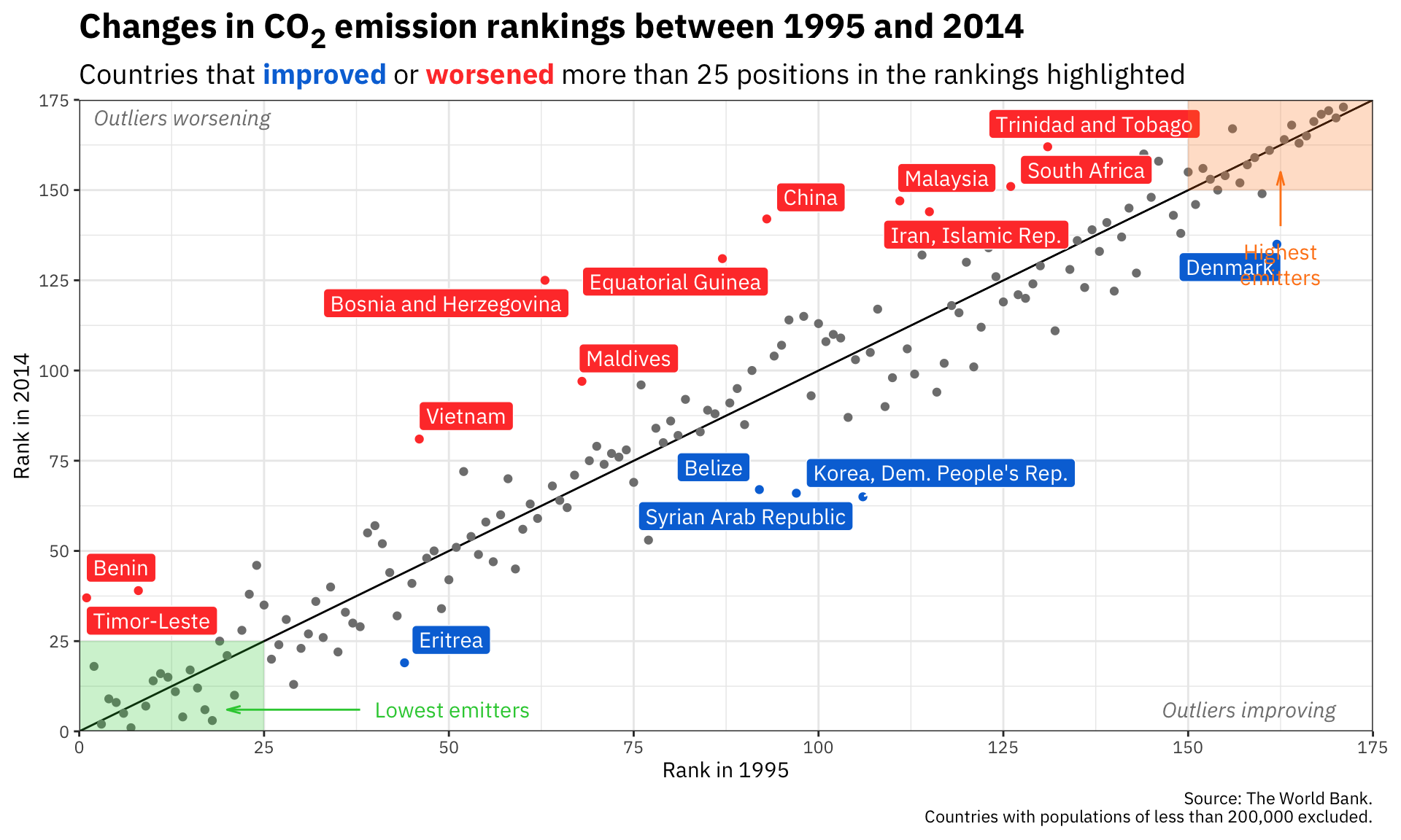
ggplot(co2_rankings,
aes(x = rank_1995, y = rank_2014)) +
# Add a reference line that goes from the bottom corner to the top corner
annotate(geom = "segment", x = 0, xend = 175, y = 0, yend = 175) +
# Add points and color them by the type of change in rankings
geom_point(aes(color = better_big_change)) +
# Add repelled labels. Only use data where big_change is TRUE. Fill them by
# the type of change (so they match the color in geom_point() above) and use
# white text
geom_label_repel(data = filter(co2_rankings, big_change == TRUE),
aes(label = country, fill = better_big_change),
color = "white") +
# Add notes about what the outliers mean in the bottom left and top right
# corners. These are italicized and light grey. The text in the bottom corner
# is justified to the right with hjust = 1, and the text in the top corner is
# justified to the left with hjust = 0
annotate(geom = "text", x = 170, y = 6, label = "Outliers improving",
fontface = "italic", hjust = 1, color = "grey50") +
annotate(geom = "text", x = 2, y = 170, label = "Outliers worsening",
fontface = "italic", hjust = 0, color = "grey50") +
# Add mostly transparent rectangles in the bottom right and top left corners
annotate(geom = "rect", xmin = 0, xmax = 25, ymin = 0, ymax = 25,
fill = "#2ECC40", alpha = 0.25) +
annotate(geom = "rect", xmin = 150, xmax = 175, ymin = 150, ymax = 175,
fill = "#FF851B", alpha = 0.25) +
# Add text to define what the rectangles abovee actually mean. The \n in
# "highest\nemitters" will put a line break in the label
annotate(geom = "text", x = 40, y = 6, label = "Lowest emitters",
hjust = 0, color = "#2ECC40") +
annotate(geom = "text", x = 162.5, y = 135, label = "Highest\nemitters",
hjust = 0.5, vjust = 1, lineheight = 1, color = "#FF851B") +
# Add arrows between the text and the rectangles. These use the segment geom,
# and the arrows are added with the arrow() function, which lets us define the
# angle of the arrowhead and the length of the arrowhead pieces. Here we use
# 0.5 lines, which is a unit of measurement that ggplot uses internally (think
# of how many lines of text fit in the plot). We could also use unit(1, "cm")
# or unit(0.25, "in") or anything else
annotate(geom = "segment", x = 38, xend = 20, y = 6, yend = 6, color = "#2ECC40",
arrow = arrow(angle = 15, length = unit(0.5, "lines"))) +
annotate(geom = "segment", x = 162.5, xend = 162.5, y = 140, yend = 155, color = "#FF851B",
arrow = arrow(angle = 15, length = unit(0.5, "lines"))) +
# Use three different colors for the points
scale_color_manual(values = c("grey50", "#0074D9", "#FF4136")) +
# Use two different colors for the filled labels. There are no grey labels, so
# we don't have to specify that color
scale_fill_manual(values = c("#0074D9", "#FF4136")) +
# Make the x and y axes expand all the way to the edges of the plot area and
# add breaks every 25 units from 0 to 175
scale_x_continuous(expand = c(0, 0), breaks = seq(0, 175, 25)) +
scale_y_continuous(expand = c(0, 0), breaks = seq(0, 175, 25)) +
# Add labels! There are a couple fancy things here.
# 1. In the title we wrap the 2 of CO2 in the HTML <sub></sub> tag so that the
# number gets subscripted. The only way this will actually get parsed as
# HTML is if we tell the plot.title to use element_markdown() in the
# theme() function, and element_markdown() comes from the ggtext package.
# 2. In the subtitle we bold the two words **improved** and **worsened** using
# Markdown asterisks. We also wrap these words with HTML span tags with
# inline CSS to specify the color of the text. Like the title, this will
# only be processed and parsed as HTML and Markdown if we tell the p
# lot.subtitle to use element_markdown() in the theme() function.
labs(x = "Rank in 1995", y = "Rank in 2014",
title = "Changes in CO<sub>2</sub> emission rankings between 1995 and 2014",
subtitle = "Countries that <span style='color: #0074D9'>**improved**</span> or <span style='color: #FF4136'>**worsened**</span> more than 25 positions in the rankings highlighted",
caption = "Source: The World Bank.\nCountries with populations of less than 200,000 excluded.") +
# Turn off the legends for color and fill, since the subtitle includes that
guides(color = "none", fill = "none") +
# Use theme_bw() with IBM Plex Sans
theme_bw(base_family = "IBM Plex Sans") +
# Tell the title and subtitle to be treated as Markdown/HTML, make the title
# 1.6x the size of the base font, and make the subtitle 1.3x the size of the
# base font. Also add a little larger margin on the right of the plot so that
# the 175 doesn't get cut off.
theme(plot.title = element_markdown(face = "bold", size = rel(1.6)),
plot.subtitle = element_markdown(size = rel(1.3)),
plot.margin = unit(c(0.5, 1, 0.5, 0.5), units = "lines"))