class: center middle main-title section-title-4 # Amounts and Proportions .class-info[ **Session 4** .light[PMAP 8921: Data Visualization with R<br> Andrew Young School of Policy Studies<br> Summer 2023] ] --- name: outline class: title title-inv-7 # Plan for today -- .box-1.medium.sp-after-half[Reproducibility] -- .box-3.medium.sp-after-half[Amounts] -- .box-5.medium.sp-after-half[Proportions] --- name: reproducibility class: center middle section-title section-title-1 animated fadeIn # Reproducibility --- layout: true class: title title-1 --- # Why am I making you learn R? -- .box-inv-1.sp-after[Pivot Tables do the same thing!] .center[ <figure> <img src="img/04/pivot-table.png" alt="Lord of the Rings PivotTable" title="Lord of the Rings PivotTable" width="80%"> </figure> ] --- # Why am I making you learn R? -- .box-inv-1.medium[More powerful] -- .box-inv-1.medium[Free and open source] -- .box-inv-1.medium.sp-after[Reproducibility] --- # Austerity and Excel .pull-left[ <figure> <img src="img/04/rr-abstract.png" alt="Reinhart and Rogoff abstract" title="Reinhart and Rogoff abstract" width="100%"> </figure> .box-inv-1[Debt:GDP ratio<br>90%+ → −0.1% growth] ] -- .pull-right.center[ <figure> <img src="img/04/path-to-prosperity.jpg" alt="The Path to Prosperity 2013 house budget" title="The Path to Prosperity 2013 house budget" width="65%"> <figcaption>Paul Ryan's 2013 House budget resolution</figcaption> </figure> ] ??? [2013 House Budget Resolution](https://republicans-budget.house.gov/uploadedfiles/pathtoprosperity2013.pdf) --- # Austerity and Excel .pull-left.center[ <figure> <img src="img/04/thomas-herndon.jpg" alt="Thomas Herndon" title="Thomas Herndon" width="55%"> <figcaption>Thomas Herndon</figcaption> </figure> ] -- .pull-right.center[ <figure> <img src="img/04/krugman-allowed.png" alt="Paul Krugman on Excel and reproducibility" title="Paul Krugman on Excel and reproducibility" width="100%"> <figcaption>From <a href="https://www.nytimes.com/2013/04/19/opinion/krugman-the-excel-depression.html" target="_blank">Paul Krugman, "The Excel Depression"</a></figcaption> </figure> ] ??? [Paul Krugman on the reproducibility crisis](https://www.nytimes.com/2013/04/19/opinion/krugman-the-excel-depression.html) --- # Austerity and Excel .center[ <figure> <img src="img/04/rr-table1.png" alt="Reinhart Rogoff Table 1" title="Reinhart Rogoff Table 1" width="47%"> </figure> ] -- .box-inv-1[Debt:GDP ratio = 90%+ → 2.2% growth (!!)] --- # Genes and Excel .pull-left-3[ .box-inv-1[Septin 2] ] .pull-middle-3[ .box-inv-1[Membrane-Associated Ring Finger (C3HC4) 1] ] .pull-right-3[ .box-inv-1[2310009E13] ] -- .center.sp-after[ <figure> <img src="img/04/excel-numbers.png" alt="Numbers in Excel" title="Numbers in Excel" width="40%"> </figure> ] -- .center[ .box-1[20% of genetics papers between 2005–2015 (!!!)] ] --- # General guidelines .box-inv-1.medium[Don't touch the raw data] .box-1[If you do, explain what you did!] -- .box-inv-1.medium[Use self-documenting, reproducible code] .box-1[R Markdown!] -- .box-inv-1.medium[Use open formats] .box-1[Use .csv, not .xlsx] --- # R Markdown in real life .pull-left.center[ <figure> <img src="img/04/airbnb.png" alt="Airbnb's data science tools" title="Airbnb's data science tools" width="100%"> <figcaption><a href="https://peerj.com/preprints/3182.pdf" target="_blank">Airbnb, ggplot, and rmarkdown</a></figcaption> </figure> ] -- .pull-right.center[ <figure> <img src="img/04/uk-long.png" alt="UK Statistics pipeline" title="UK Statistics pipeline" width="100%"> </figure> <figure> <img src="img/04/uk-short.png" alt="UK Statistics pipeline, short" title="UK Statistics pipeline, short" width="55%"> <figcaption><a href="https://dataingovernment.blog.gov.uk/2017/03/27/reproducible-analytical-pipeline/" target="_blank">The UK's reproducible analysis pipeline</a></figcaption> </figure> ] ??? https://peerj.com/preprints/3182.pdf + https://gdsdata.blog.gov.uk/2017/03/27/reproducible-analytical-pipeline/ --- layout: false name: amounts class: center middle section-title section-title-3 animated fadeIn # Amounts --- layout: true class: title title-3 --- # Yay bar plots! .box-inv-3[We are a lot better at visualizing<br>line lengths than angles and areas] .pull-left[ <img src="04-slides_files/figure-html/example-pie-1.png" width="100%" style="display: block; margin: auto;" /> ] .pull-right[ <img src="04-slides_files/figure-html/example-bar-1.png" width="100%" style="display: block; margin: auto;" /> ] --- # Oh no bar plots! .pull-left.center[ <figure> <img src="img/04/obamacareenrollment-fncchart.jpg" alt="Fox News Obamacare enrollment" title="Fox News Obamacare enrollment" width="100%"> </figure> ] -- .pull-right.center[ <figure> <img src="img/04/econcharts-education.gif" alt="Obama graduation rate" title="Obama graduation rate" width="100%"> </figure> ] ??? https://blog.ed.gov/2014/10/progress-on-education-is-helping-fuel-our-economys-growth/ and https://www.mediamatters.org/fox-news/dishonest-fox-charts-obamacare-enrollment-edition and https://twitter.com/ObamaWhiteHouse/status/517743415375974401 --- # Start at zero .box-inv-3.medium.sp-after[The entire line length matters,<br>so don't truncate it!] -- .box-3.large.sp-after[Always start at 0] -- .box-inv-3.sp-after[(Or don't use bars)] --- # Bar plots and summary statistics .box-inv-3.medium[\#barbarplots] .center[ <video controls> <source src="https://datavizm20.s3.amazonaws.com/barbarcharts.mp4" type="video/mp4"> <figcaption><a href="https://www.kickstarter.com/projects/1474588473/barbarplots" target="_blank">See the original at Kickstarter</a> if the video doesn't work in your browser</figcaption> </video> ] ??? [\#barbarplot Kickstarter campaign](https://www.kickstarter.com/projects/1474588473/barbarplots) --- # Bar plots and summary statistics .pull-left[ <img src="04-slides_files/figure-html/animal-weight-bar-1.png" width="100%" style="display: block; margin: auto;" /> ] -- .pull-right[ <img src="04-slides_files/figure-html/animal-weight-points-1.png" width="100%" style="display: block; margin: auto;" /> ] --- # Show more data with strip plots .left-code[ ```r ggplot(animals, aes(x = animal_type, y = weight, color = animal_type)) + geom_point(position = position_jitter(height = 0), size = 1) + labs(x = NULL, y = "Weight") + guides(color = "none") ``` ] .right-plot[  ] --- # Show more data with beeswarm plots .left-code[ ```r library(ggbeeswarm) ggplot(animals, aes(x = animal_type, y = weight, color = animal_type)) + geom_beeswarm(size = 1) + # Or try this too: # geom_quasirandom() + labs(x = NULL, y = "Weight") + guides(color = "none") ``` ] .right-plot[  ] --- # Combine boxplots with points .left-code[ ```r ggplot(animals, aes(x = animal_type, y = weight, color = animal_type)) + geom_boxplot(width = 0.5) + geom_point(position = position_jitter(height = 0), size = 1, alpha = 0.5) + labs(x = NULL, y = "Weight") + guides(color = "none") ``` ] .right-plot[  ] --- # Combine violins with points .left-code[ ```r ggplot(animals, aes(x = animal_type, y = weight, color = animal_type)) + geom_violin(width = 0.5) + geom_point(position = position_jitter(height = 0), size = 1, alpha = 0.5) + labs(x = NULL, y = "Weight") + guides(color = "none") ``` ] .right-plot[  ] --- # Overlapping ridgeplots .left-code[ ```r library(ggridges) ggplot(animals, aes(x = weight, y = animal_type, fill = animal_type)) + geom_density_ridges() + labs(x = "Weight", y = NULL) + guides(fill = "none") ``` ] .right-plot[  ] --- # General rules .box-inv-3.medium[Bar charts always start at zero] -- .box-inv-3.medium[Don't use bars for summary statistics.<br>You throw away too much information.] -- .box-inv-3.medium[The end of the bar is often all that matters] --- # Lots of alternatives .box-inv-3.SMALL[We'll use a summarized version of the gapminder dataset as an example] .left-code.small-code[ ```r library(gapminder) gapminder_continents <- gapminder %>% filter(year == 2007) %>% # Only look at 2007 count(continent) %>% # Get a count of continents arrange(desc(n)) %>% # Sort descendingly by count # Make continent into an ordered factor mutate(continent = fct_inorder(continent)) ggplot(gapminder_continents, aes(x = continent, y = n, fill = continent)) + geom_col() + guides(fill = "none") + labs(x = NULL, y = "Number of countries") ``` ] .right-plot[ 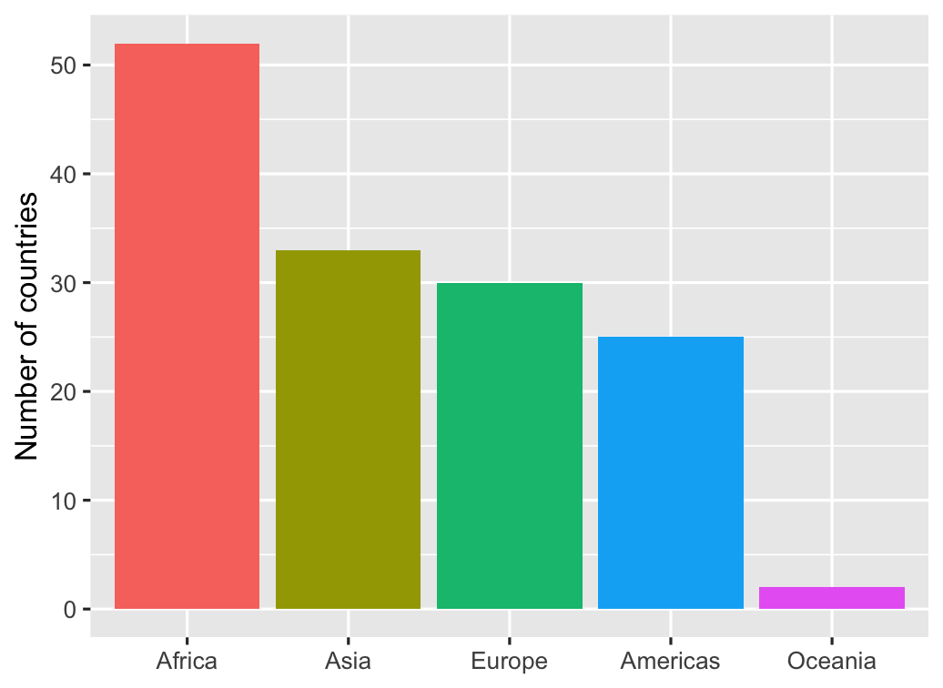 ] --- # Alternatives: Lollipop charts .box-inv-3[Since the end of the bar is important, emphasize it the most] .left-code[ ```r ggplot(gapminder_continents, aes(x = continent, y = n, color = continent)) + geom_pointrange(aes(ymin = 0, ymax = n)) + guides(color = "none") + labs(x = NULL, y = "Number of countries") ``` ] .right-plot[ 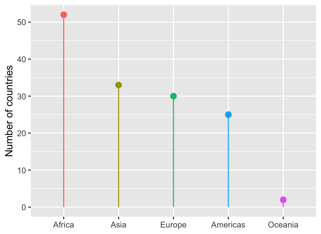 ] --- # Alternatives: Waffle charts .box-inv-3[Show the individual observations as squares] .left-code[ ```r # This has to be installed in a special way--you can't use the Packages panel. # Run this in your console: # devtools::install_github("hrbrmstr/waffle") library(waffle) ggplot(gapminder_continents, aes(x = continent, y = n, fill = continent)) + geom_waffle(aes(values = n), # geom_waffle() needs a special values aesthetic n_rows = 9, # It has lots of other options too flip = TRUE, na.rm = TRUE) + labs(fill = NULL) + coord_equal() + # Make all the squares square theme_void() # Use a completely empty theme ``` ] .right-plot[ 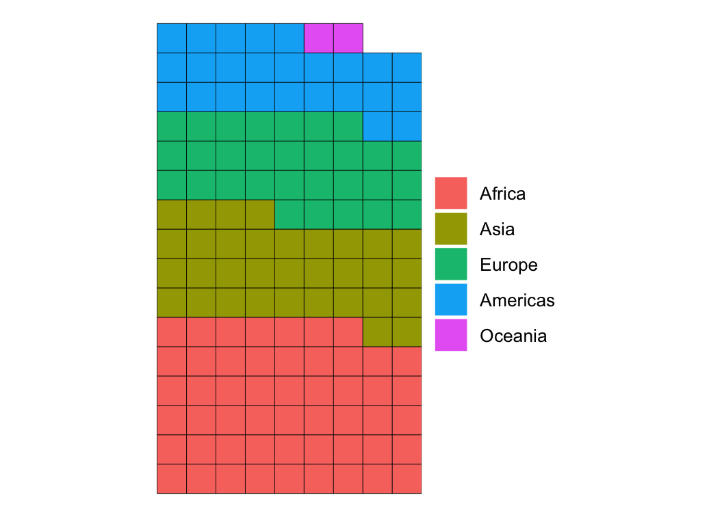 ] --- # Alternatives: Heatmaps .box-inv-3[If exact counts are less important,<br>try a heatmap with `geom_tile()`] .center[ <figure> <img src="img/04/births-heatmap.png" alt="US births heatmap" title="US births heatmap" width="60%"> </figure> ] --- layout: false name: proportions class: center middle section-title section-title-5 animated fadeIn # Proportions --- layout: true class: title title-5 --- # Why proportions? .box-inv-5.sp-after[Sometimes we want to compare values across<br>a whole population instead of looking at raw counts] -- .box-inv-5[Only do this when it makes analytical sense!] -- .box-5[COVID-19 amounts vs. proportions] --- # Pie charts .box-inv-5[Perceptual issues with angle and fill space] -- .box-inv-5[Only okay(ish) if there are a few easily distinguishable categories] -- .pull-left[ <img src="04-slides_files/figure-html/pie-good-1.png" width="100%" style="display: block; margin: auto;" /> ] .pull-right[ <img src="04-slides_files/figure-html/pie-bad-1.png" width="100%" style="display: block; margin: auto;" /> ] --- # Alternatives .box-inv-5[Bar plots] -- .box-inv-5[Any of the alternatives to bar plots] -- .box-inv-5[Treemaps and mosaic plots<br>(but these can still be really hard to interpret)] --- # Treemaps and mosaic plots .pull-left[ .box-inv-5[Treemaps with the [{treemapify}](https://cran.r-project.org/web/packages/treemapify/vignettes/introduction-to-treemapify.html) package] <figure> <img src="img/04/treemap.png" alt="Treemap" title="Treemap" width="100%"> </figure> ] .pull-right[ .box-inv-5[Mosaic plots with the [{ggmosaic}](https://cran.r-project.org/web/packages/ggmosaic/vignettes/ggmosaic.html) package] <figure> <img src="img/04/mosaic.png" alt="Mosaic" title="Mosaic" width="100%"> </figure> ] --- # Alternatives .box-inv-5[Bar plots] .box-inv-5[Any of the alternatives to bar plots] .box-inv-5[Treemaps and mosaic plots<br>(but these can still be really hard to interpret)] .box-inv-5[Specialized figures like parliament plots] --- # Parliament plots .box-inv-5[Parliament plots with the [{ggparliament}](https://github.com/RobWHickman/ggparliament) package] .pull-left[ <figure> <img src="img/04/senate.png" alt="US Senate parliament plot" title="US Senate parliament plot" width="100%"> </figure> ] .pull-right[ <figure> <img src="img/04/parliament.png" alt="UK parliament plot" title="UK parliament plot" width="100%"> </figure> ]