ggplot(data = mpg, mapping = aes(x = displ, y = hwy)) +
geom_point()Sessions 5 and 6 tips and FAQs
FAQs
Hi everyone!
I’m really happy with how you all did with exercises 5 and 6 (you made some legitimately hideous plots!).
I got a lot of similar questions and I saw some common issues in the assignments, so like normal, I’ve compiled them all here. Enjoy!
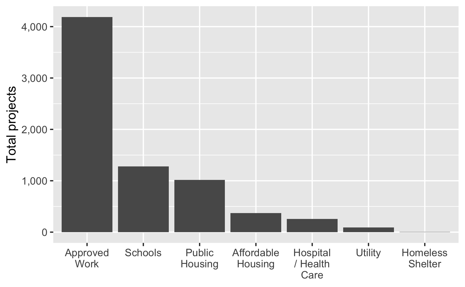
My axis labels are overlapping and ugly. How can I fix that?
Sometimes you’ll have text that is too long to fit comfortably as axis labels and the labels will overlap and be gross:
Check out this blog post for a bunch of different ways to fix this and make nicer labels, like this:
Why isn’t the example code using data = whatever and mapping = aes() in ggplot() anymore? Do we not have to use argument names?
In the first few sessions, you wrote code that looked like this:
In R, you feed functions arguments like data and mapping and I was having you explicitly name the arguments, like data = mpg and mapping = aes(...).
In general it’s a good idea to use named arguments, since it’s clearer what you mean.
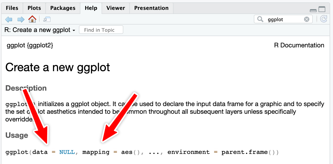
However, with really common functions like ggplot(), you can actually skip the names. If you look at the documentation for ggplot() (i.e. run ?ggplot in your R console or search for “ggplot” in the Help panel in RStudio), you’ll see that the first expected argument is data and the second is mapping.
If you don’t name the arguments, like this…
ggplot(mpg, aes(x = displ, y = hwy)) +
geom_point()…ggplot() will assume that the first argument (mpg) really means data = mpg and that the second really means mapping = aes(...).
If you don’t name the arguments, the order matters. This won’t work because ggplot will think that the aes(...) stuff is really data = aes(...):
ggplot(aes(x = displ, y = hwy), mpg) +
  geom_point()
If you do name the arguments, the order doesn’t matter. This will work because it’s clear that data = mpg (even though this feels backwards and wrong):
ggplot(mapping = aes(x = displ, y = hwy), data = mpg) +
  geom_point()
This works with all R functions. You can either name the arguments and put them in whatever order you want, or you can not name them and use them in the order that’s listed in the documentation.
In general, you should name your arguments for the sake of clarity. For instance, with aes(), the first argument is x and the second is y, so you can technically do this:
ggplot(mpg, aes(displ, hwy)) +
  geom_point()
That’s nice and short, but you have to remember that displ is on the x-axis and hwy is on the y-axis. And it gets extra confusing once you start mapping other columns:
ggplot(mpg, aes(displ, hwy, color = drv, size = hwy)) +
  geom_point()
All the other aesthetics like color and size are named, but x and y aren’t, which just feels… off.
So use argument names except for super common things like ggplot() and the {dplyr} verbs like mutate(), group_by(), filter(), etc.
In chapter 22, Wilke talks about tables—is there a way to make pretty tables with R?
Absolutely! We don’t have time in this class to cover tables, but there’s a whole world of packages for making beautiful tables with R. Three of the more common ones are {gt}, {kableExtra}, and {flextable}:
| Package | Output support | Notes | |||
|---|---|---|---|---|---|
| HTML | Word | ||||
Great |
Okay |
Okay |
Has the goal of becoming the “grammar of tables” (hence “gt”). It is supported by developers at Posit and gets updated and improved regularly. It’ll likely become the main table-making package for R. | ||
Great |
Great |
Okay |
Works really well for HTML output and has the best support for PDF output, but development has stalled for the past couple years and it seems to maybe be abandonded, which is sad. | ||
Great |
Okay |
Great |
Works really well for HTML output and has the best support for Word output. It’s not abandonded and gets regular updates. | ||
Here’s a quick illustration of these three packages. All three are incredibly powerful and let you do all sorts of really neat formatting things ({gt} even makes interactive HTML tables!), so make sure you check out the documentation and examples. I personally use all three, depending on which output I’m working with. When knitting to HTML, I use {gt}; when knitting to PDF I use {gt} or {kableExtra}; when knitting to Word I use {flextable}.
library(tidyverse)

cars_summary <- mpg %>%
  group_by(year, drv) %>%
  summarize(
    n = n(),
    avg_mpg = mean(hwy),
    median_mpg = median(hwy),
    min_mpg = min(hwy),
    max_mpg = max(hwy)
)library(gt)
cars_summary %>%
gt() %>%
cols_label(
drv = "Drive",
n = "N",
avg_mpg = "Average",
median_mpg = "Median",
min_mpg = "Minimum",
max_mpg = "Maximum"
) %>%
tab_spanner(
label = "Highway MPG",
columns = c(avg_mpg, median_mpg, min_mpg, max_mpg)
) %>%
fmt_number(
columns = avg_mpg,
decimals = 2
) %>%
tab_options(
row_group.as_column = TRUE
)| Drive | N | Highway MPG | ||||
|---|---|---|---|---|---|---|
| Average | Median | Minimum | Maximum | |||
| 1999 | 4 | 49 | 18.84 | 17 | 15 | 26 |
| f | 57 | 27.91 | 26 | 21 | 44 | |
| r | 11 | 20.64 | 21 | 16 | 26 | |
| 2008 | 4 | 54 | 19.48 | 19 | 12 | 28 |
| f | 49 | 28.45 | 29 | 17 | 37 | |
| r | 14 | 21.29 | 21 | 15 | 26 | |
library(kableExtra)

cars_summary %>%
  ungroup() %>%
  select(-year) %>%
  kbl(
    col.names = c("Drive", "N", "Average", "Median", "Minimum", "Maximum"),
    digits = 2
  ) %>%
  kable_styling() %>%
  pack_rows("1999", 1, 3) %>%
  pack_rows("2008", 4, 6) %>%
add_header_above(c(" " = 2, "Highway MPG" = 4))| Drive | N | Average | Median | Minimum | Maximum |
|---|---|---|---|---|---|
| 1999 | |||||
| 4 | 49 | 18.84 | 17 | 15 | 26 |
| f | 57 | 27.91 | 26 | 21 | 44 |
| r | 11 | 20.64 | 21 | 16 | 26 |
| 2008 | |||||
| 4 | 54 | 19.48 | 19 | 12 | 28 |
| f | 49 | 28.45 | 29 | 17 | 37 |
| r | 14 | 21.29 | 21 | 15 | 26 |
library(flextable)

cars_summary %>%
  rename(
    "Year" = year,
    "Drive" = drv,
    "N" = n,
    "Average" = avg_mpg,
    "Median" = median_mpg,
    "Minimum" = min_mpg,
    "Maximum" = max_mpg
    ) %>%
  mutate(Year = as.character(Year)) %>%
  flextable() %>%
  colformat_double(j = "Average", digits = 2) %>%
  add_header_row(values = c(" ", "Highway MPG"), colwidths = c(3, 4)) %>%
  align(i = 1, part = "header", align = "center") %>%
  merge_v(j = ~ Year) %>%
  valign(j = 1, valign = "top")
| Highway MPG | |||||
|---|---|---|---|---|---|---|
Year | Drive | N | Average | Median | Minimum | Maximum |
1999 | 4 | 49 | 18.84 | 17 | 15 | 26 |
f | 57 | 27.91 | 26 | 21 | 44 | |
r | 11 | 20.64 | 21 | 16 | 26 | |
2008 | 4 | 54 | 19.48 | 19 | 12 | 28 |
f | 49 | 28.45 | 29 | 17 | 37 | |
r | 14 | 21.29 | 21 | 15 | 26 | |
You can also create more specialized tables for specific situations, like side-by-side regression results tables with {modelsummary} (which uses {gt}, {kableExtra}, or {flextable} behind the scenes)
library(modelsummary)

model1 <- lm(hwy ~ displ, data = mpg)
model2 <- lm(hwy ~ displ + drv, data = mpg)

modelsummary(
  list(model1, model2),
  stars = TRUE,
  # Rename the coefficients
  coef_rename = c(
    "(Intercept)" = "Intercept",
    "displ" = "Displacement",
    "drvf" = "Drive (front)",
    "drvr" = "Drive (rear)"),
  # Get rid of some of the extra goodness-of-fit statistics
  gof_omit = "IC|RMSE|F|Log",
  # Use {gt}
  output = "gt"
)| (1) | (2) | |
|---|---|---|
| Intercept | 35.698*** | 30.825*** |
| (0.720) | (0.924) | |
| Displacement | -3.531*** | -2.914*** |
| (0.195) | (0.218) | |
| Drive (front) | 4.791*** | |
| (0.530) | ||
| Drive (rear) | 5.258*** | |
| (0.734) | ||
| Num.Obs. | 234 | 234 |
| R2 | 0.587 | 0.736 |
| R2 Adj. | 0.585 | 0.732 |
| + p < 0.1, * p < 0.05, ** p < 0.01, *** p < 0.001 | ||
Double encoding and excessive legends
As you’ve read, double encoding aesthetics can be helpful for accessibility and printing reasons—for instance, if points have colors and shapes, they’re still readable by people who are colorblind or if the image is printed in black and white:
ggplot(mpg, aes(x = displ, y = hwy, color = drv, shape = drv)) +
  geom_point()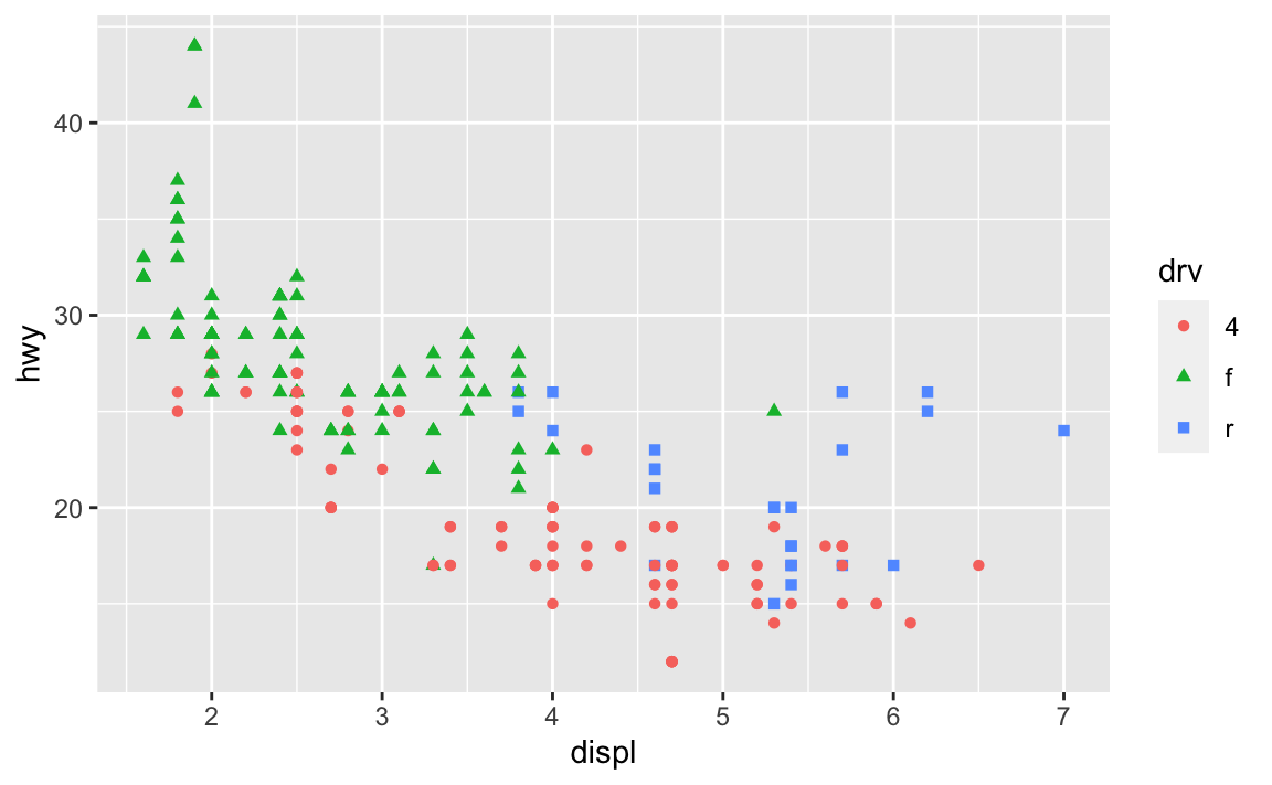
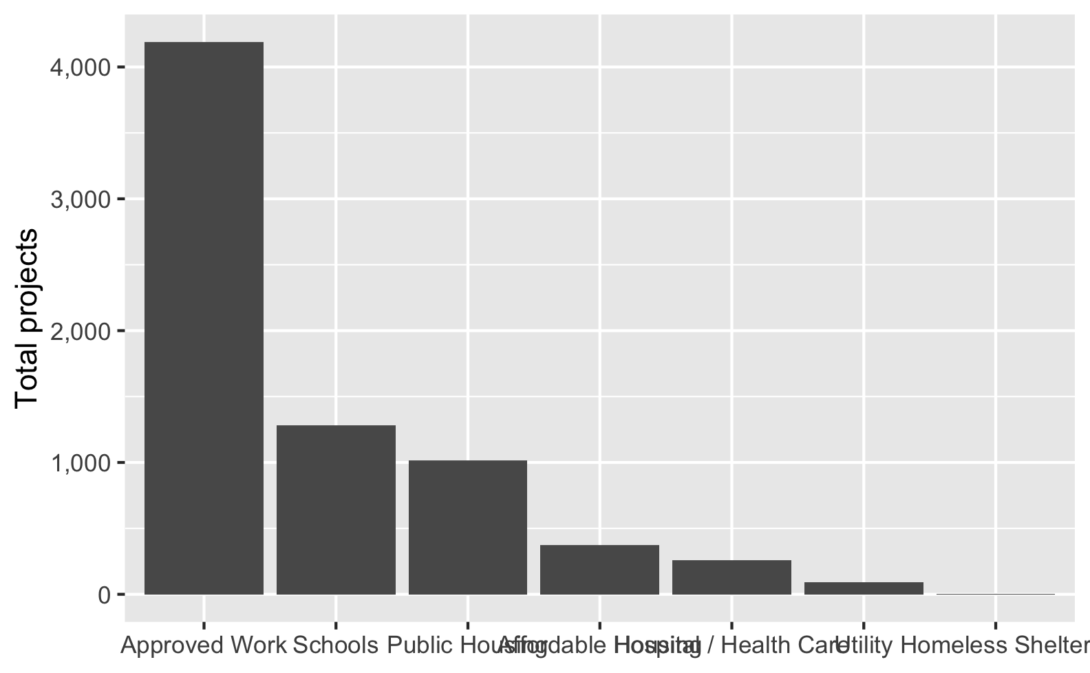
Sometimes the double encoding can be excessive though, and you can safely remove legends. For example, in exercises 3 and 4, you made bar charts showing counts of different things (words spoken in The Lord of the Rings; pandemic-era construction projects in New York City), and lots of you colored the bars, which is great!
car_counts <- mpg %>%
  group_by(drv) %>%
  summarize(n = n())

ggplot(car_counts, aes(x = drv, y = n, fill = drv)) +
  geom_col()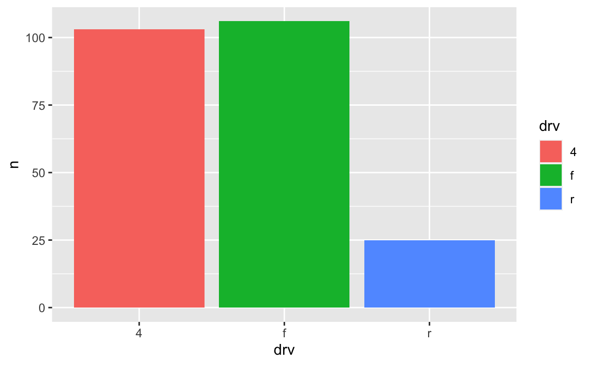
Car drive here is double encoded: it’s on the x-axis and it’s the fill. That’s great, but having the legend here is actually a little excessive. Both the x-axis and the legend tell us what the different colors of drives are (four-, front-, and rear-wheeled drives), so we can safely remove the legend and get a little more space in the plot area:
ggplot(car_counts, aes(x = drv, y = n, fill = drv)) +
  geom_col() +
  guides(fill = "none")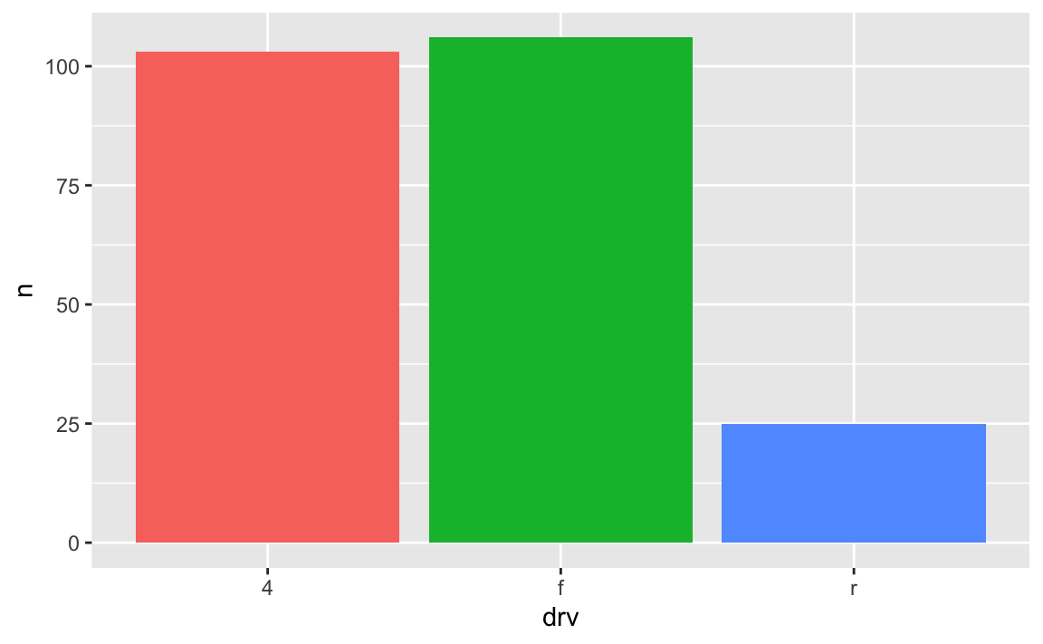
I have numbers like 20000 and want them formatted with commas like 20,000. Can I do that automatically?
Yes you can! There’s an incredible package called {scales}. It lets you format numbers and axes and all sorts of things in magical ways. If you look at the documentation, you’ll see a ton of label_SOMETHING() functions, like label_comma(), label_dollar(), and label_percent().
You can use these different labeling functions inside scale_AESTHETIC_WHATEVER() layers in ggplot.
label_comma() adds commas:
library(scales)
library(gapminder)

gapminder_2007 <- gapminder %>%
  filter(year == 2007)

ggplot(gapminder_2007, aes(x = gdpPercap)) +
  geom_histogram(binwidth = 1000) +
  scale_x_continuous(labels = label_comma())
label_dollar() adds commas and includes a “$” prefix:
ggplot(gapminder_2007, aes(x = gdpPercap)) +
  geom_histogram(binwidth = 1000) +
  scale_x_continuous(labels = label_dollar())
label_percent() multiplies values by 100 and formats them as percents:
gapminder_percents <- gapminder_2007 %>%
  group_by(continent) %>%
  summarize(n = n()) %>%
  mutate(prop = n / sum(n))

ggplot(gapminder_percents, aes(x = continent, y = prop)) +
  geom_col() +
  scale_y_continuous(labels = label_percent())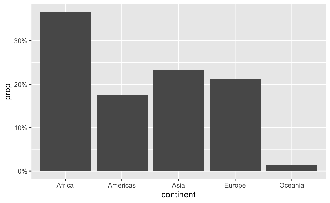
You can also change a ton of the settings for these different labeling functions. Want to format something as Euros and use periods as the number separators instead of commas, like Europeans? Change the appropriate arguments! You can check the documentation for each of the label_WHATEVER() functions to see what you can adjust (like label_dollar() here)
ggplot(gapminder_2007, aes(x = gdpPercap)) +
  geom_histogram(binwidth = 1000) +
  scale_x_continuous(labels = label_dollar(prefix = "€", big.mark = "."))
All the label_WHATEVER() functions actually create copies of themselves, so if you’re using lots of custom settings, you can create your own label function, like label_euro() here:
# Make a custom labeling function
label_euro <- label_dollar(prefix = "€", big.mark = ".")

# Use it on the x-axis
ggplot(gapminder_2007, aes(x = gdpPercap)) +
  geom_histogram(binwidth = 1000) +
  scale_x_continuous(labels = label_euro)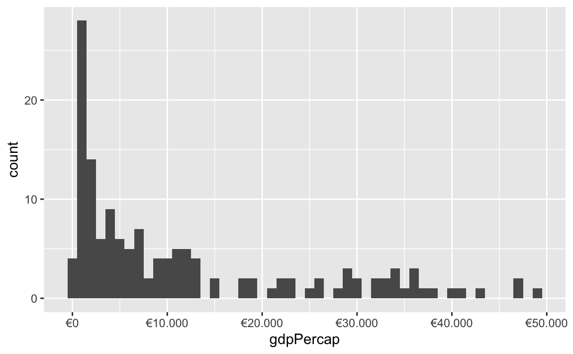
These labeling functions also work with other aesthetics, like fill and color and size. Use them in scale_AESTHETIC_WHATEVER():
ggplot(
  gapminder_2007,
  aes(x = gdpPercap, y = lifeExp, size = pop, color = pop)
) +
  geom_point() +
  scale_x_continuous(labels = label_dollar()) +
  scale_size_continuous(labels = label_comma()) +
  scale_color_viridis_c(labels = label_comma())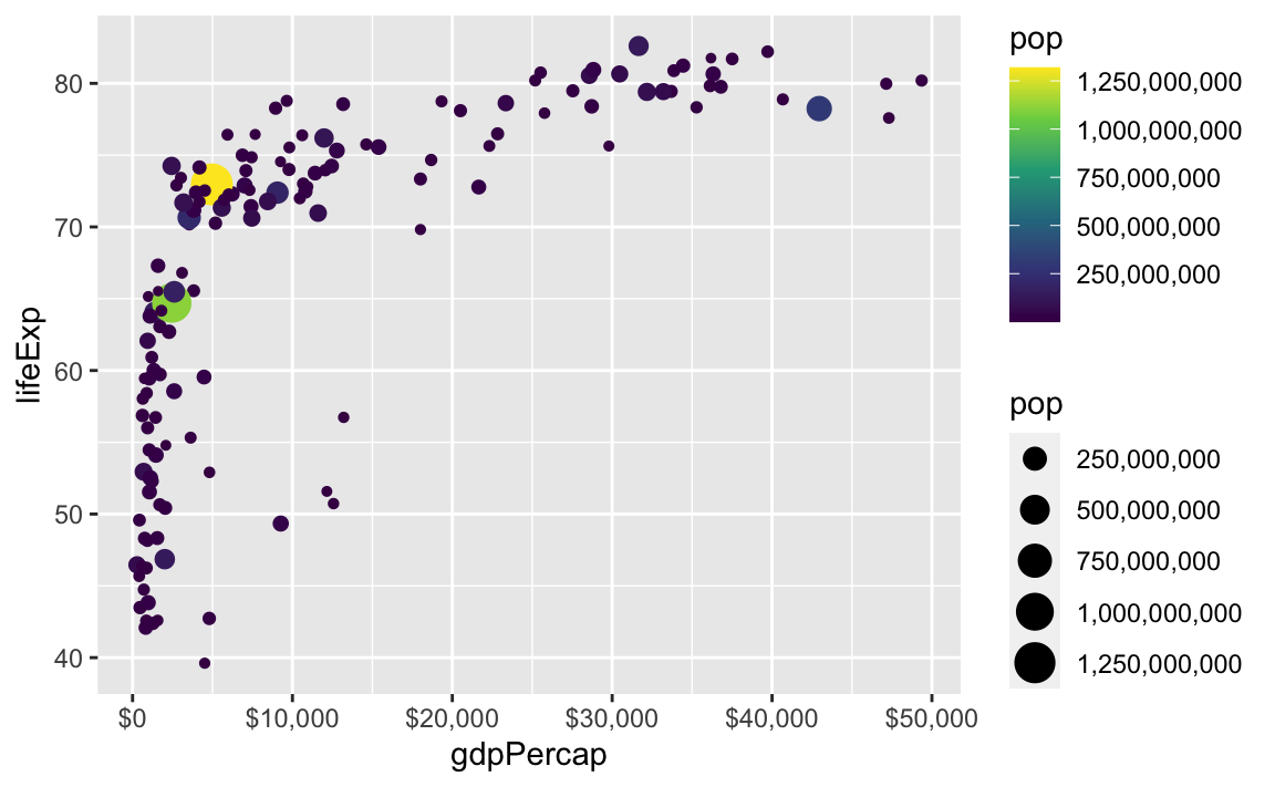
There are also some really neat and fancy things you can do with scales, like formatting logged values, abbreviating long numbers, and many other things. Check out this post for an example of working with logged values.
ggplot(
  gapminder_2007,
  aes(x = gdpPercap, y = lifeExp, size = pop, color = continent)
) +
  geom_point() +
  scale_x_log10(breaks = 500 * 2^seq(0, 9, by = 1),
                labels = label_dollar(scale_cut = cut_short_scale())) +
  scale_size_continuous(labels = label_comma(scale_cut = cut_short_scale()))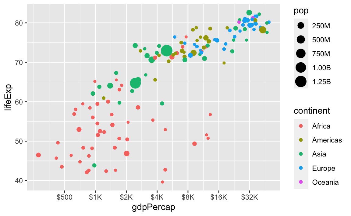
Legends are cool, but I’ve read that directly labeling things can be better. Is there a way to label things without a legend?
Yes! Later in the semester we’ll cover annotations, but in the meantime, you can check out a couple packages that let you directly label geoms that have been mapped to aesthetics.
{geomtextpath}
The {geomtextpath} package lets you add labels directly to paths and lines with functions like geom_textline() and geom_labelline() and geom_labelsmooth().
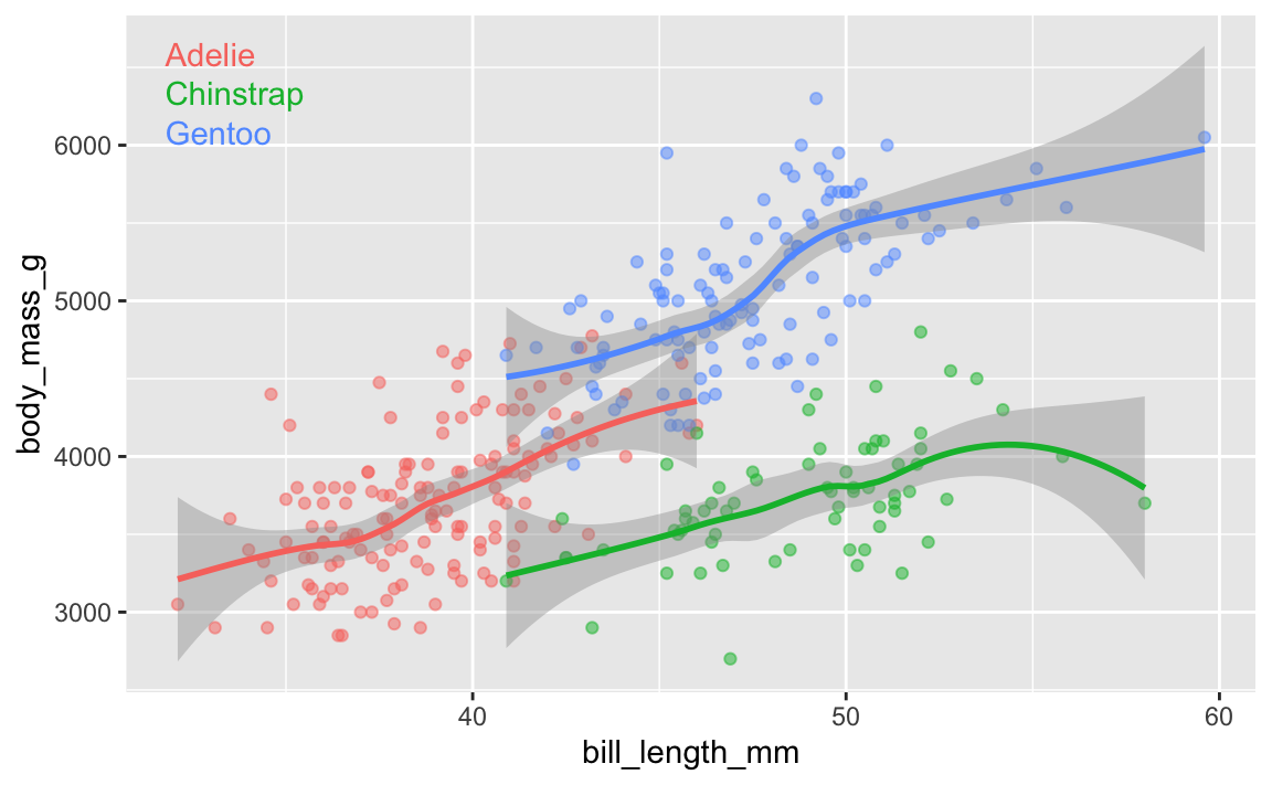
Like, here’s the relationship between penguin bill lengths and penguin weights across three different species:
# This isn't on CRAN, so you need to install it by running this:
# remotes::install_github("AllanCameron/geomtextpath")
library(geomtextpath)
library(palmerpenguins)  # Penguin data

# Get rid of the rows that are missing sex
penguins <- penguins %>% drop_na(sex)

ggplot(
  penguins,
  aes(x = bill_length_mm, y = body_mass_g, color = species)
) +
  geom_point(alpha = 0.5) +  # Make the points a little bit transparent
  geom_labelsmooth(
    aes(label = species),
    # This spreads the letters out a bit
    text_smoothing = 80
  ) +
  # Turn off the legend bc we don't need it now
  guides(color = "none")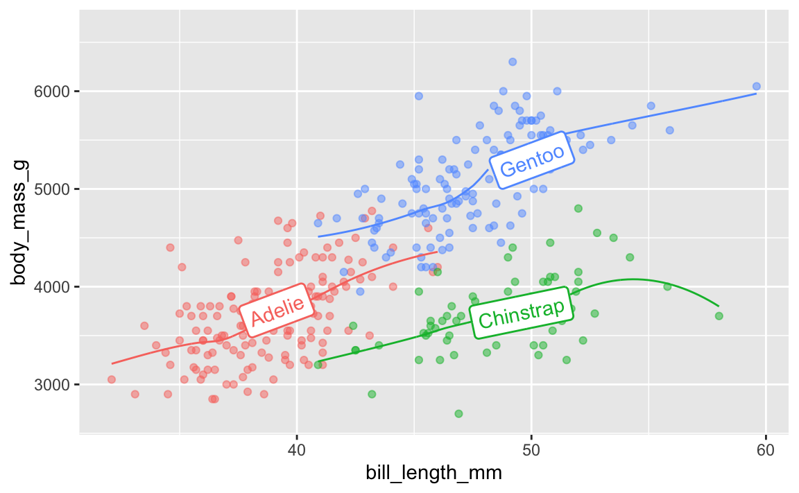
And the average continent-level life expectancy across time:
gapminder_lifeexp <- gapminder %>%
  group_by(continent, year) %>%
  summarize(avg_lifeexp = mean(lifeExp))

ggplot(
  gapminder_lifeexp,
  aes(x = year, y = avg_lifeexp, color = continent)
) +
  geom_textline(
    aes(label = continent, hjust = continent),
    linewidth = 1, size = 4
  ) +
  guides(color = "none")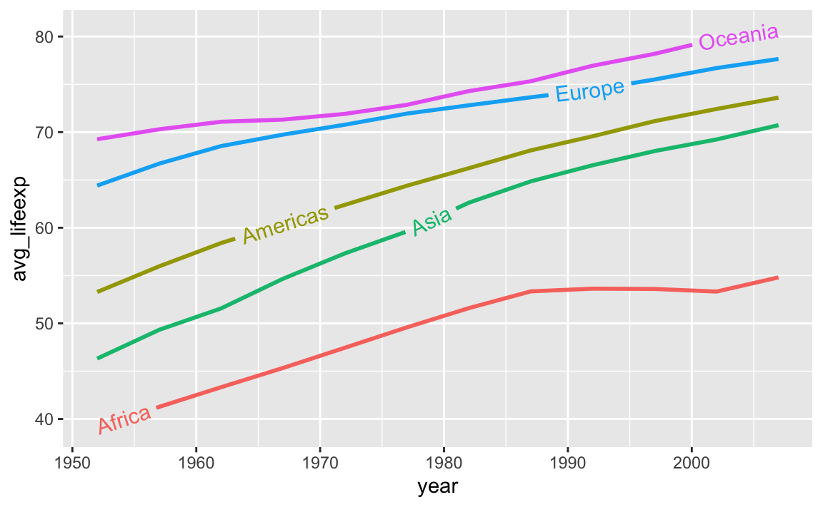
{ggdirectlabel}
A new package named {ggdirectlabel} lets you add legends directly to your plot area:
# This also isn't on CRAN, so you need to install it by running this:
# remotes::install_github("MattCowgill/ggdirectlabel")
library(ggdirectlabel)

ggplot(
  penguins,
  aes(x = bill_length_mm, y = body_mass_g, color = species)
) +
  geom_point(alpha = 0.5) +
  geom_smooth() +
  geom_richlegend(
    aes(label = species),  # Use the species as the fake legend labels
    legend.position = "topleft",  # Put it in the top left
    hjust = 0  # Make the text left-aligned (horizontal adjustment, or hjust)
  ) +
  guides(color = "none")